

Not all business websites have what it takes to impress visitors. Effortlessly beautiful design, user friendliness, and great content are just a few of the things that make a website really stand out. For this blog, we scoured the internet for some impressive Philadelphia business websites. We’ll pick apart each website, say what’s good, and also share what we think could use some work. Click on the business names to see their websites.
In no particular order, we enjoyed:
WebLinc
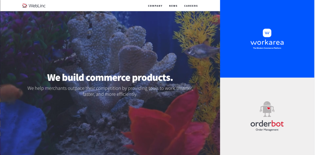
WebLinc’s website is so different from some of the humdrum websites you see out there today. It’s simple and straight to the point; within three seconds, a visitor will know what they do as a company. The series of video clips on the homepage definitely keeps you engaged, and the clips give you a feel for their culture.
The good and bad:
Good:
-
Clear messaging right off the bat.
-
Simple design. No overcrowding of information.
-
Subpages feature unique shapes and bright colors to break up content in a pleasing way that makes sense.
-
Looks great on mobile (I may actually prefer the mobile view).
Bad:
-
The navigation menu leaves a lot to be desired. I wish there were more menu items like a ‘contact us’ and ‘team’ page instead of having to scroll down the ‘company’ page to get all of that information.
-
Lack of footer. If a visitor just wants WebLinc’s phone number or to know where they’re located, they’ll have to scroll all the way to the bottom of the ‘Company’ page. This might not come very intuitively to visitors. Also, it’s just instinctual for me to scroll to the bottom of a homepage to find more information.
-
When I first visited this site, like I said, I thought it was extremely unique, but I was confused about the two large blocks on the side of the screen. I didn’t know what to do with those blocks until I learned more about them.
-
No calls-to-action. Maybe this is why I was confused about the blocks on the side of the page. There’s no clear direction for where a visitor should go once they’re on the homepage.
Revzilla
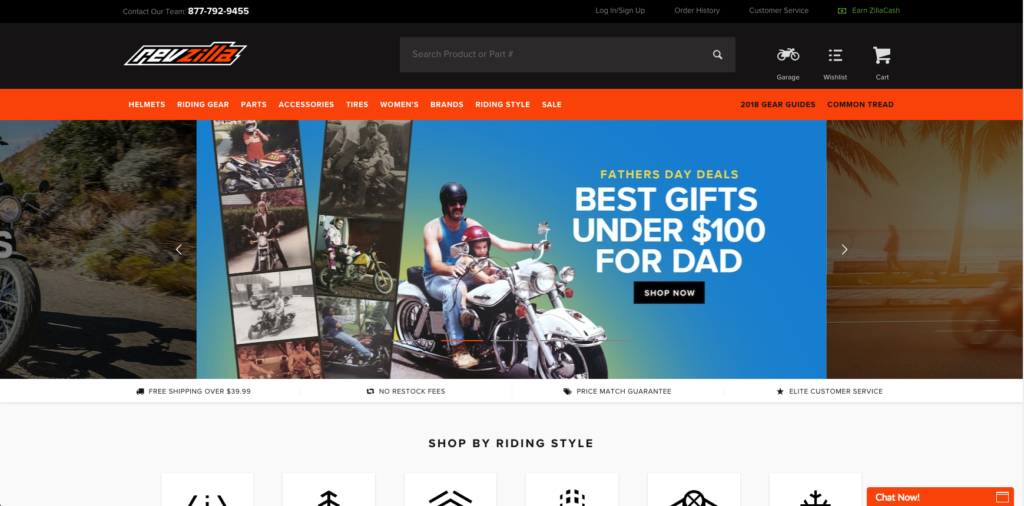
Revzilla is a great example of a well done ecommerce website. This is a large website with a ton of different products, but they still manage to organize it in a relatively clear way.
The good and bad:
Good:
-
Clear slider with call-to-action buttons.
-
Mobile-friendly design.
-
Right off the bat, you see clear messaging about what sets them apart: “Free shipping over $39.99,” “no restock fees,” “price match guarantee,” “elite customer service,” etc.
-
Category buttons and following subpages are easily navigable.
Bad:
-
The homepage is jam-packed with content. To someone not familiar with this website, the information hierarchy could seem confusing. Plus, the homepage is overly long.
-
The navigation menu is gigantic. This is understandable since it is such a large website, but I actually like the way the menus are set up on mobile better than on desktop. The mobile menu features a clearer, more palatable design.
-
All subpages (not including product pages) seem overly long like the homepage. This is attributed to the large video section, the blog section, and the gigantic footer underneath all of the relevant information from that subpage.
LevLane
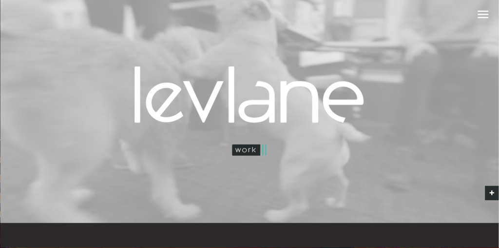
LevLane’s homepage features eye-catching imagery and videos everywhere you look. Their use of large, bold images makes the site look polished and professional.
The good and bad:
Good:
-
Bold, minimalist design with a consistent color palette.
-
Intriguing full screen video draws in visitors. Accompanied by the “work” button, this section gives good direction to where they want their visitors to look.
-
The subpages feature bold colored boxes with cute icons.
-
The individual work pages use stunning, high-resolution images that have a nice flow about them.
Bad:
-
If I landed on their homepage with no context, I wouldn’t know what the company does at all. Plus, that image of the two CEOs gives me all the wrong feelings.
-
Continuity across all pages seems off.
-
Personally, I am not a huge fan of having a mobile menu hamburger on a desktop. It’s that one extra step that visitors would have to take or could miss altogether. However, there are some arguments defending the hamburger, see here.
-
CTAs are buried in the work samples, and not all pages have them.
DrexelBrook Catering
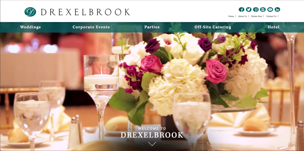
Drexelbrook Catering has jumped on the very popular homepage video background bandwagon. This one really stands out though because it tells a story – taking visitors through the happiness of a wedding day.
The good and bad:
Good:
-
The way information is broken up on the homepage is clear and aesthetically pleasing. The use of different colored sections and alternating images helps this. Also, the textured backgrounds of the white areas add some life to what otherwise may look just plain.
-
The homepage is chock full of CTAs.
-
Subpages aren’t overly full of information. Keeping it short and sweet is the way to go.
-
They did a good job with the double navigation menu, highlighting what’s most important but still providing visitors with links for ‘about us’ and ‘contact us.’
Bad:
-
The ‘sign up for our newsletter’ button takes you away from the website to a third-party provider (Constant Contact). For visitors that don’t know what Constant Contact is, it may be viewed as untrustworthy to them – especially when they’re supposed to be sharing personal information.
-
Subpages don’t have the best quality images in the slider, which kind of takes away from the polished look of the website.
-
Some external links open in the same window, taking visitors away from the Drexelbrook website. It’s always a good idea to make sure your external links are opening in a new window.
-
On the subpages, the extra sidebar menu doesn’t look bad from a design perspective, but I’m not sure it’s necessary to have. From whatever page you’re on, any of those items that are in the sidebar are available in the same amount of clicks at the top navigation menu.
Arena Strategies
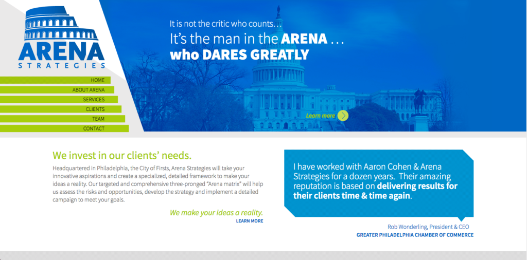
Arena Strategies has a unique website, straying away from the typical horizontal navigation menu. The homepage features bold colors, intriguing shapes, and concise information.
The good and bad:
Good:
-
Different sections on the homepage are emphasized by different colors and background textures.
-
Consistent flow of diagonally cut shapes give the site a cool look and feel.
-
Clear cut information and short pages make finding whatever you need, simple.
-
Mobile-friendly.
Bad:
-
The menu is unique, but it’s difficult to navigate the horizontal “drop-downs.” I also wish the menu item text was left-aligned.
-
On mobile-view, there’s no header images like there are in desktop-view. This takes away from the mobile site and makes it look very plain.
-
The homepage could benefit from ‘contact us’ CTA or a chat feature. Something prompting website visitors to reach out.
-
This website has no blog section. For SEO purposes, blogging is a great way to get noticed by search engines. Regularly adding fresh content to your website is a good thing.
Overall, these Philadelphia business websites are crushing it. Too often, businesses brush their websites aside instead of treating them like their most important asset. With billions of internet users surfing the web everyday, it’s a no-brainer that you should have a solid website.
Looking for some help with building a business website? Follow our simple guide. If you have any questions or need further help, please feel free to contact us at info@bytesizedigital.com or use the chat feature on our website!
